The usage format is the final dimension of the finished product after trimming, which the Client will receive. On all our templates, the usage format is marked in red.
The project format is the size of the prepared file in millimeters, which includes the usage dimension along with bleeds. On all our templates, the project format is marked in blue.
Bleed is a safety margin added to the graphic design beyond the usage format. Its purpose is to avoid white edges after trimming the sheet. The standard bleed is 2 mm on each side of the project.
Safe margins are the distance of key elements of the project from the cutting, creasing, or other structural elements of the work. They ensure that important content is not accidentally cut or disturbed. On all our templates, the areas of safe placement of key project elements (safe margins) are marked in green.
Apla is a uniform coverage of a given print area with a color of constant saturation, without tonal transitions – both 100% and lower values.
Tint is a variant of color with reduced saturation (e.g., 20%, 50%), often used to create lighter tones. Tint is thus a type of apla with lower coverage.
To achieve deep and saturated black depending on the printing technology, the color components should be appropriately selected. Below are the recommended values for individual printing methods:
Deep Black
100%K
To achieve neutral and stable grays in offset printing, gray apla should not be created using only the K (black) component. Such gray may have an undesirable tint (greenish or brownish), especially on larger surfaces or different papers. However, in digital printing, using only the K component reduces the risk of banding.
To avoid the most common mistakes and problems, it is worth following the rules below:
To achieve deep and saturated black depending on the printing technology, the color components should be appropriately selected. Below are the recommended values for individual printing methods:
Note: We do not guarantee color consistency in subsequent print runs. Differences may result from printing technology and material specifics.
Ensure correct page orientation - it should be set head-to-head. Read more
Selective varnishing on the cutting or creasing line is not recommended. The varnish may peel off in flakes, affecting the product's aesthetics.
Remember the cutting tolerance of ±1 mm. Frames and thin borders at the edges may be asymmetrical and look unaesthetic.
Only CMYK. Other color spaces Pantone/RGB will be automatically converted and may not meet expectations.
All fonts should be converted to curves or embedded in the PDF file. Recommended minimum font size is 6 pt., in reverse 8pt (Reverse composition - placing white or light characters on a darker background. The purpose of using reverse composition is to highlight the text).
Files should be flattened to a single layer and should not contain transparencies. A flattened file is one where we do not have access to layers and actions performed in the project. The file can also be partially flattened, e.g., having texts converted to curves. Then the content will be non-editable, but we can still change their position. Other project elements will still be fully editable.
Unlaminated paper with a weight of 250-350 g/m² will crack on the creasing lines. To avoid this, we recommend lamination.
The usage size can be any within the limits specified in the calculators, depending on the printing technology and selected material. Information about limitations will appear in the calculator.
The project format must take into account the usage size increased by the bleed. We require standard bleeds of 2 mm on each side.
The background and all graphic elements adjacent to the edge must extend to the bleed beyond the usage format. Even if the background does not cover the bleeds, the project format must comply with the specification.
Important project elements should be at least 3 mm away from the cutting, creasing, or other structural elements of the work.
Works should be prepared in the CMYK color space.
The maximum sum of tonal values at one point should not exceed:
Note! Avoid placing saturated apla on the same places of the front and back.
Where possible, we recommend using the ICC profile ISO Coated v2_300. This profile limits the total color components to 300%, which helps avoid excess ink issues and ensures better print quality.
Please do not use overprints, as applying it to a color other than black may cause errors in the print.
To achieve deep black:
Large aplas may show inconsistencies. We recommend replacing them with textures to improve aesthetics.
Do not use transitions below 5% to avoid banding. Adding noise will help achieve smoother gradients.
Optimal and recommended resolution for raster graphics and photos:
Do not artificially increase resolution through resampling. Resampling is the process of resizing an image in computer graphics, which involves adjusting the number of pixels in the image to new dimensions. During this process, pixels are recalculated, and new pixel values are computed based on existing data. Resampling is often used when changing the size or resolution of an image.
Convert text to vector objects to avoid issues with missing fonts.
Use black built only from K=100% (C=0, M=0, Y=0, K=100) to achieve uniform and sharp text.
The minimum font size is 6 pt. for black text. In reverse 8pt. (white/light text on a black background).
All pages in the file should have the same orientation to avoid printing errors.
Usage is standardly reversed relative to each other "Head to Head". In some projects, such as postcards or double-sided leaflets, the correct orientation of the front relative to the back may not be obvious. To ensure correct reversal, always place both sides in the file in the same orientation.
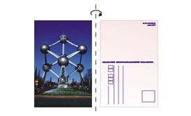
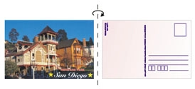
During imposition (assembly, electronic montage - designing the image of the entire print sheet in a DTP program), usage is rotated relative to the vertical edge:
During imposition, usage is rotated relative to the vertical edge: